Flight Management
UX/UI Design | UX Research
Business and problem
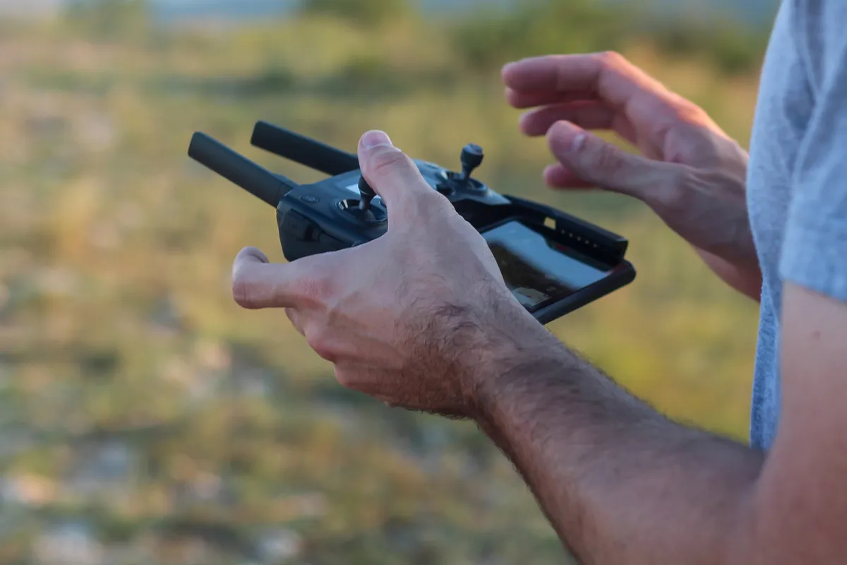
The company offered drone services to farmers: spraying, crop scouting and pest detection. When a farmer hired the service, the company assigned a pilot to carry out the operation in the field. As operations grew, tracking missions internally became harder and harder.
The problem wasn't a lack of information, but too much dispersion.
There was no centralized platform: flight statuses, mission data and operational information circulated between spreadsheets and WhatsApp groups, creating communication noise and lost context. The challenge was to bring everything together in one place, so the internal team (operators and pilots) could follow the progress of operations clearly and hierarchically.
How I worked on the project
I led the design of the platform, from exploratory research to validating the prototype with stakeholders.
Exploratory research
I spoke with the main stakeholder and two drone pilots to understand which information was essential for tracking operations and where the friction points were.
Market benchmark
I analyzed competing platforms, complementing the exploratory research with market references for the platform's design.
Information architecture
I structured the system's scope in a sitemap with its own color system, which separated what was reading from what was action within the platform.
Style Guide and prototype
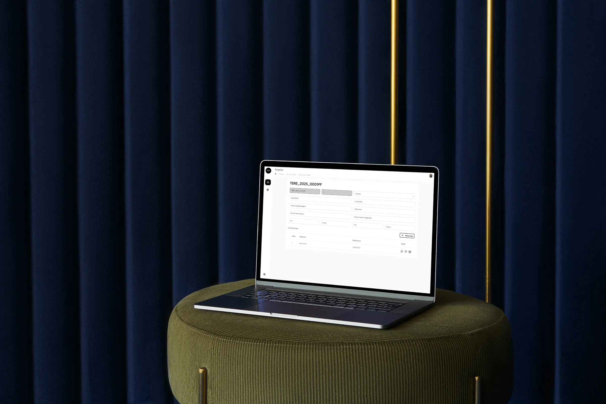
I created the Style Guide and prototyped the platform's screens in Figma, focusing on status clarity and a consistent visual hierarchy.
Backlog management
I managed the project backlog across iterations, keeping the scope aligned with stakeholders.
Validation
I validated the prototype with stakeholders in frequent alignments focused on fine-tuning, which allowed me to iterate quickly.
How I reached the solution
The project began with exploratory research with the main stakeholder and two drone pilots, to understand which information was essential for tracking operations and where the biggest friction points were.
With those insights in hand, I structured the information architecture and developed a sitemap with its own color system, which separated what was reading from what was action. I complemented it with a benchmark of competing platforms. The sitemap helped with the project's internal organization and with stakeholder validation, making it easier to spot gaps and align expectations about what the system should cover.
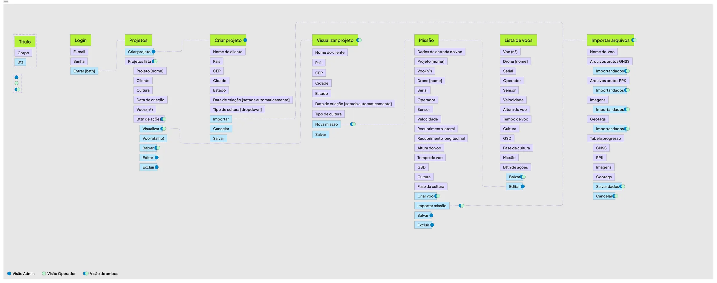
The main design challenge was turning a technically complex operation, with a hierarchy of projects, missions and flights, into something any operator could follow without extensive training. To get there, the solution was built around four principles:
Status clarity
The operator needed to know, within seconds, what was happening.
Information and action
Separation of information and action, to reduce the risk of error in critical operations.
Visual hierarchy
Consistent, reflecting the real structure of operations: project → mission → flight.
Noise reduction
Screens with a high volume of data called for focus, not decoration.
With the architecture defined, I created the Style Guide and prototyped the screens in Figma, managing the project backlog throughout the iterations. Stakeholder alignments were frequent and focused on fine-tuning: the scope was well defined from the first meeting, which allowed me to iterate faster.
What was delivered
The result was the platform prototype, validated with stakeholders, which brings together in one place information previously scattered across spreadsheets and WhatsApp and gives the internal team a unified view of how operations are progressing.
The prototype also served to align the operational view across the team's different profiles (pilots, operators and coordination), with the aim of reducing reliance on informal communication to coordinate activities.
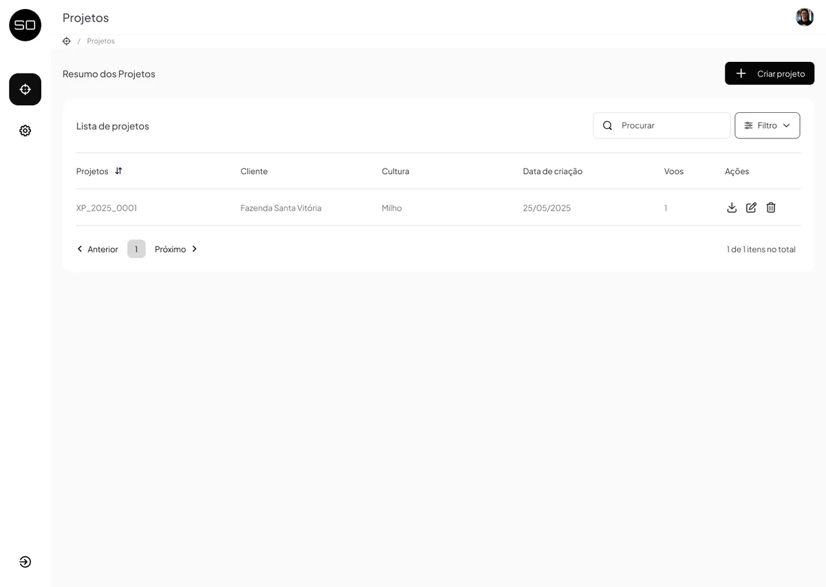
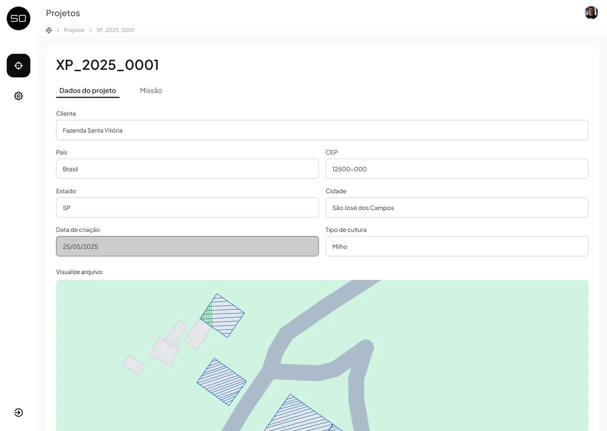
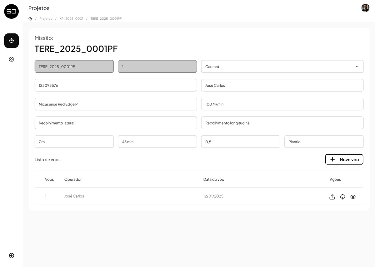
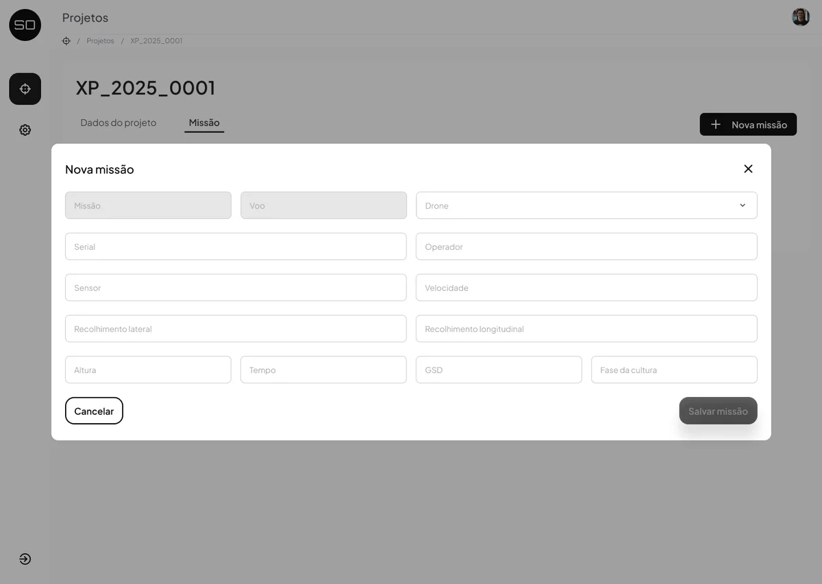
The main improvements proposed were:
- Clear visibility of the hierarchy between projects, missions and flights
- Progress tracking designed for real time
- Explicit separation between actions and reads, designed to reduce the risk of error
- A scalable foundation for future evolution of the platform
What I learned
This project reinforced the importance of information architecture in products with complex hierarchical structures. More than organizing screens, the challenge was to create a navigation logic that reflected how operators thought about their own work, not how the system had been technically structured.
The color system in the sitemap, which started as an internal tool, ended up becoming an alignment instrument with stakeholders: a way to make visible the distinction between what the system shows and what it lets you do. This kind of intermediate artifact, which makes conversations easier before the prototype exists, is something I carry into other projects.
If I were to do it again, I would broaden the research to include more profiles within the operation, especially coordinators who followed multiple projects at once, to understand how the platform would behave in high-demand operational scenarios.