Motel Guide
UI Design | UX Writing
Business and problem
Guia de Motéis is an app for booking motel rooms and personalizing the stay, with special items added to the order, such as perks and exclusive decorations. The project was a hiring-process challenge: redesigning the app's landing page while keeping the brand's visual identity and voice.
Booking personalization, one of the app's highlights, could only be found in the FAQ.
The goal was to highlight the app's main advantages, such as room booking and exclusive customizations. For that, the page needed to communicate better what the app offers, and it had usability and communication problems.
How I worked on the project
I carried out the challenge end to end, from analyzing the current page to documenting the proposed layout, combining interface design and UX Writing.
Research and benchmark
I ran research and a market benchmark to ground the project's design decisions before defining the layout.
Opportunity analysis
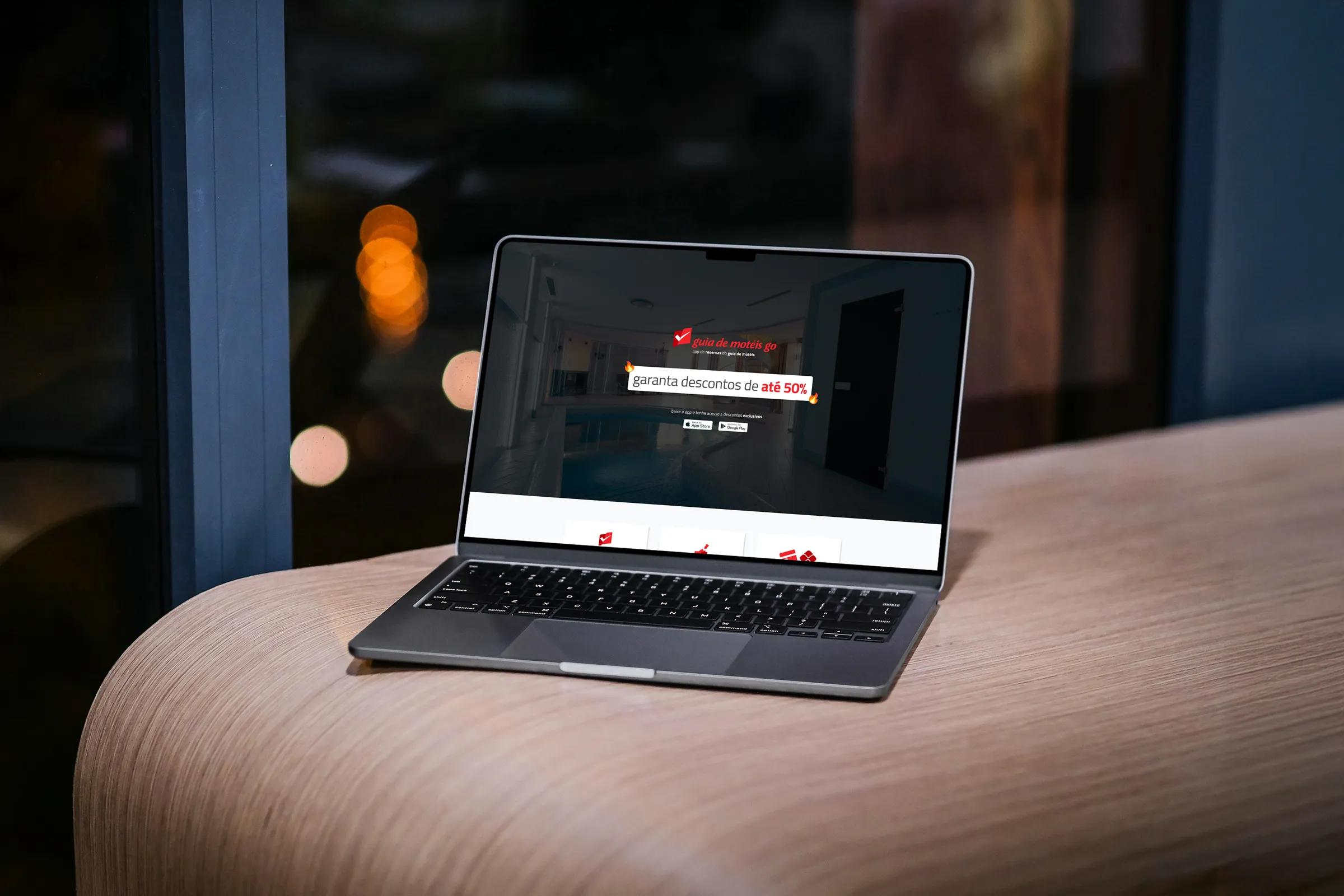
I assessed the current landing page and identified usability and communication improvements, such as the background video, the discounts, the store links and the FAQ.
Wireframes and prototype
I designed low- and high-fidelity wireframes, for mobile and desktop, and built the full prototype in Figma.
Style Guide and components
I created the Style Guide and the page components, aligned with the brand's visual identity and voice.
UX Writing
I applied UX Writing to the page copy, such as replacing the “FAQ” label with the plain-language “Perguntas Frequentes” (Frequently Asked Questions), for clear, user-centered communication.
Documentation
I documented the whole process, from the initial structuring to the presentation of the proposed layout, ensuring alignment with the brand.
How I reached the solution
The project started with research and a market benchmark, followed by an analysis of the current landing page.
Four opportunities came out of that analysis, and the redesign set out to solve them while keeping the brand's visual identity and voice:
Looping video
On limited data plans, continuous playback can use a lot of data. In some stretches, the overlaid text was hard to read.
Discounts
Percentages other than the main one were displayed, which caused confusion: “up to 50% off” already conveys the highest discount available.
Store links
When clicked, they redirected to the same page in a new tab instead of taking the user to the expected destination.
FAQ
There was no search field, it was worth offering contact with support, and the information that under-18s can't enter needed more prominence.
With the opportunities mapped, the work followed in stages: low-fidelity wireframes, creation of components and content, high-fidelity wireframes for mobile and desktop and, finally, product documentation.
What was delivered
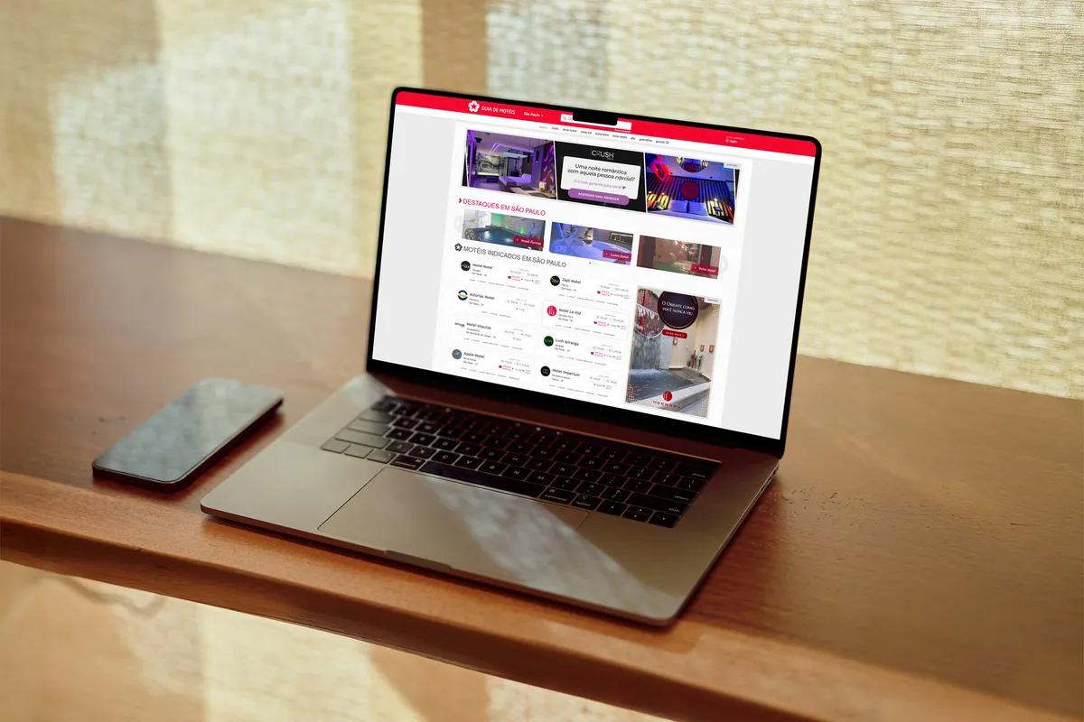
The result was a proposal for a new landing page, compared against the current layout.
The main changes were:
- Age confirmationA modal requires users to confirm they are over 18 by clicking “SIM” (yes) before accessing the page. Previously, this information wasn't prominently displayed.
- First screenI replaced the background video with a static image, with users on limited data plans in mind, and made the discount the main element, as an incentive to download the app.
- Booking personalizationI highlighted the “Melhore sua experiência” (“Improve your experience”) feature, which lets users add perks and exclusive decorations. It already appeared in the app stores, but on the page it could only be found in the FAQ. In the Go Fidelidade (loyalty program) section, I adjusted the copy and updated the mockup to show more clearly how users collect stamps and enjoy the program's benefits.
- Download call to action and social proofI added a new call to download the app and user reviews taken from the App Store and Google Play.
- FAQI renamed the title to “Perguntas Frequentes” (Frequently Asked Questions), in simpler and more accessible language, and added a search field so users can look up their question directly or browse topics.
What I learned
In this project, I combined interface design and UX Writing to make sure the landing page's communication was clear and centered on the user experience.
Changes such as renaming the FAQ section in plain language and swapping the background video for a static image came from looking at different usage scenarios and at the needs and limitations of the people who visit the page.