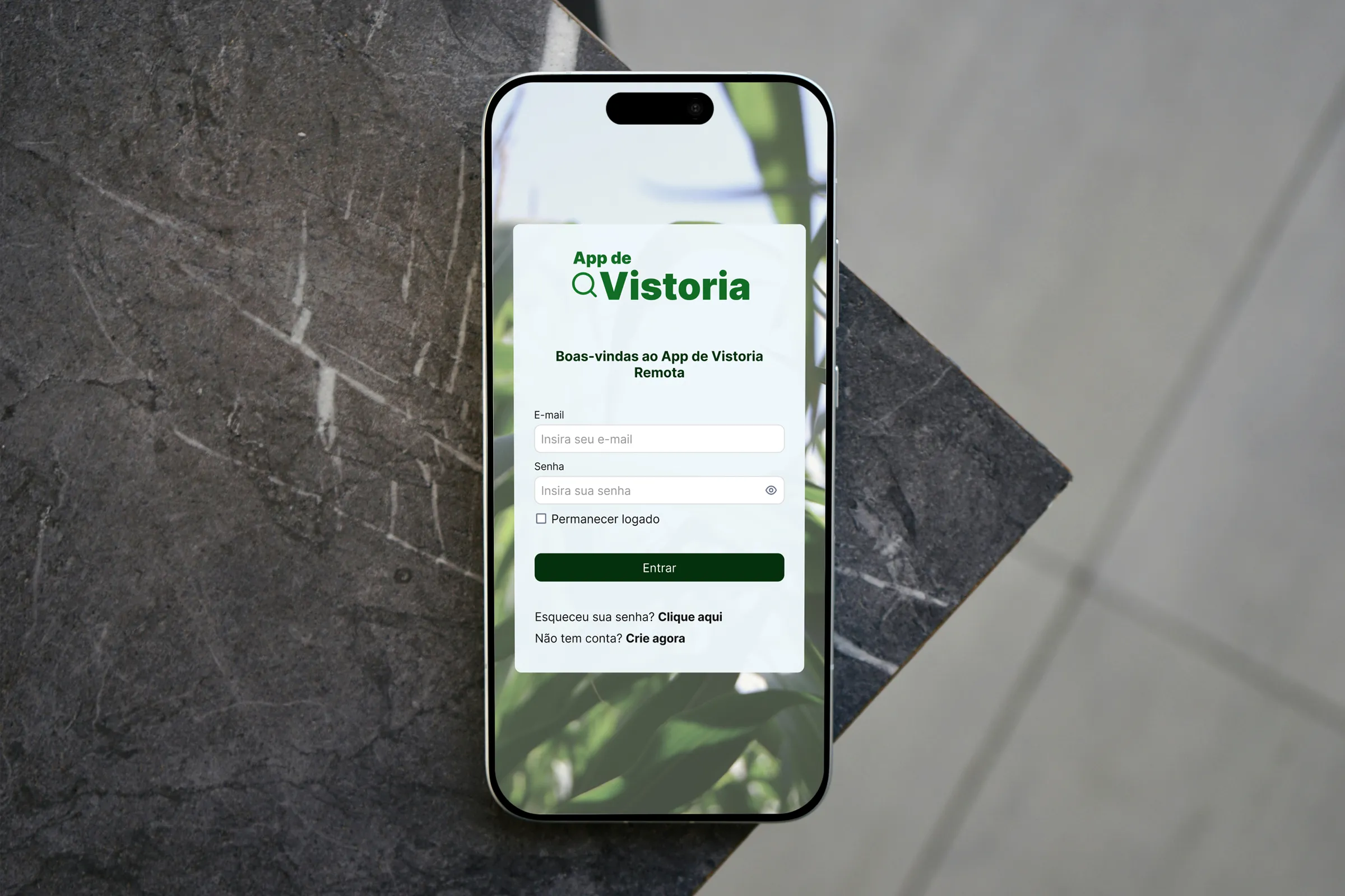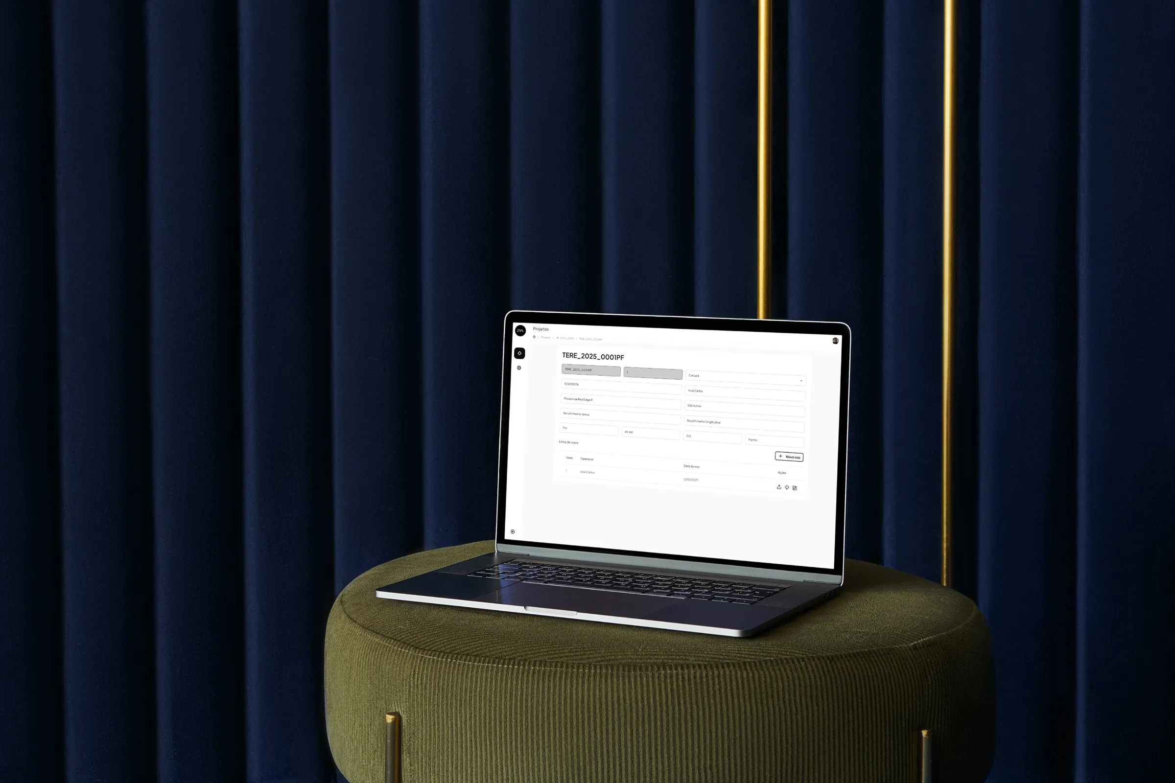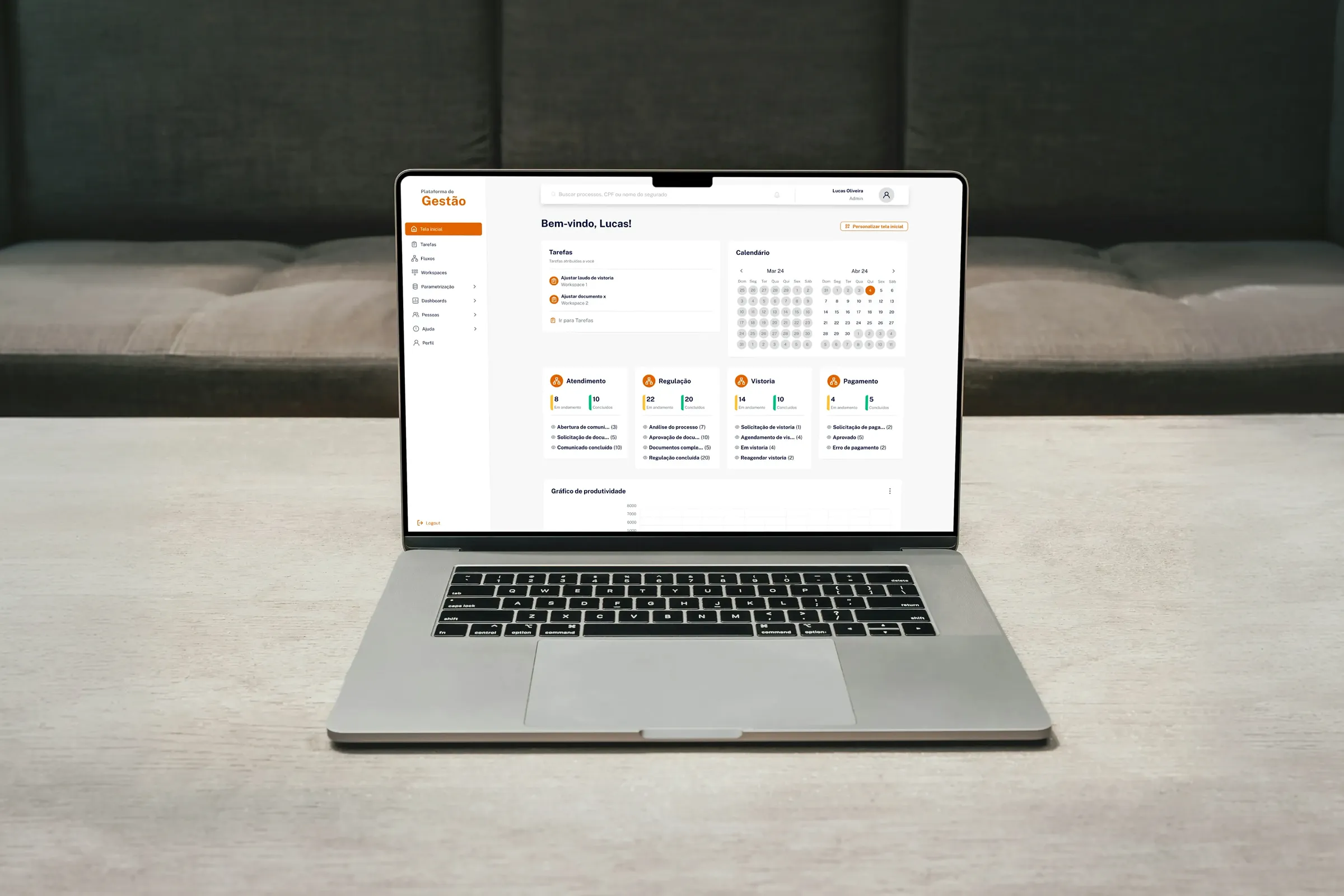
Management Platform
UX/UI Design | UX Research
Business and problem
In 2017, a claims management system was launched to centralize the entire operational cycle of an insurance company, from the first notice of loss to payment to the policyholder. As the operation grew through 2023, the product began showing clear signs of wear: slowness, an excess of unused fields, frequent bugs and increasing difficulty configuring the system for new flows.
Support became a mandatory middleman for any adjustment, and that didn't scale.
The challenge was to evolve the product into a more flexible model, allowing flow customization and reducing the technical dependency of day-to-day operations. The biggest internal concern was increasing the complexity of a system that was already hard to maintain, without compromising the ongoing operation.

How I worked on the project
I worked end to end, from research through development follow-up, in close collaboration with the PO and stakeholders.
Research and discovery
I ran quantitative and qualitative research, with interviews with users and stakeholders, and organized the data with Affinity Mapping. I also benchmarked the market for references.
Structure and design
I built the flowchart that distributes information and fields across screens, prototyped in Figma and maintained the Design System, creating new components for the project.
Decisions and prioritization
Based on the interviews, I advocated for team-based access profiles, approved as a pillar of the new architecture, and weighed user impact against technical effort when prioritizing.
Validation and sign-off
I validated prototypes with stakeholders, led the sign-off meetings with clients and ran continuous validations with prototypes and questionnaires, even without formal testing.
Handoff and backlog
I aligned with and handed off to the development team, managed the backlog, created the tasks in ClickUp and followed development through to delivery.
Quality
I audited the design against the staging system and tested flows in the development environment, playing the role of QA, to check that the delivery matched what was designed.
How I reached the solution
I worked in close collaboration with the PO and stakeholders throughout the project, including delivery sign-off meetings that I led directly with clients. The research combined quantitative analysis (error volume, usage patterns, support tickets) with qualitative interviews with users and stakeholders. This cross-check was essential to separate internal perception from real operational problems.
One of the most important findings came from the interviews: the need for access profiles that differ by team, with each team accessing only the features of its role. Internally there was resistance, since creating profiles seemed to add complexity, but the data showed that the lack of this separation caused operational noise and a risk of errors. I made the case for the decision by presenting real usage profiles and concrete problems, and the proposal became one of the pillars of the new architecture. The solution was structured around three fronts, guided by a prioritization criterion:
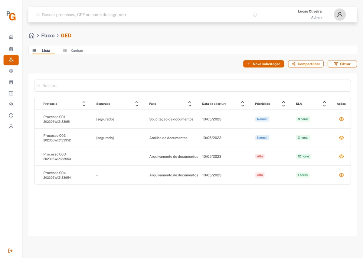
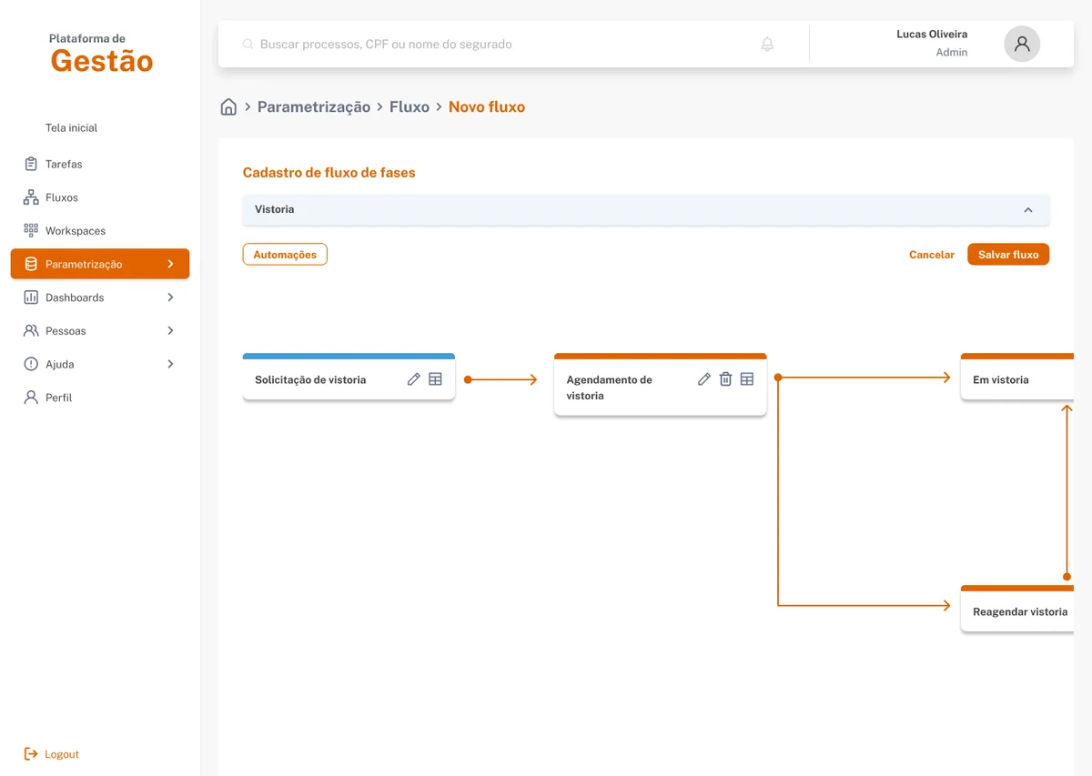
Customizable flows
By process type: each team could configure its own cycle without depending on development.
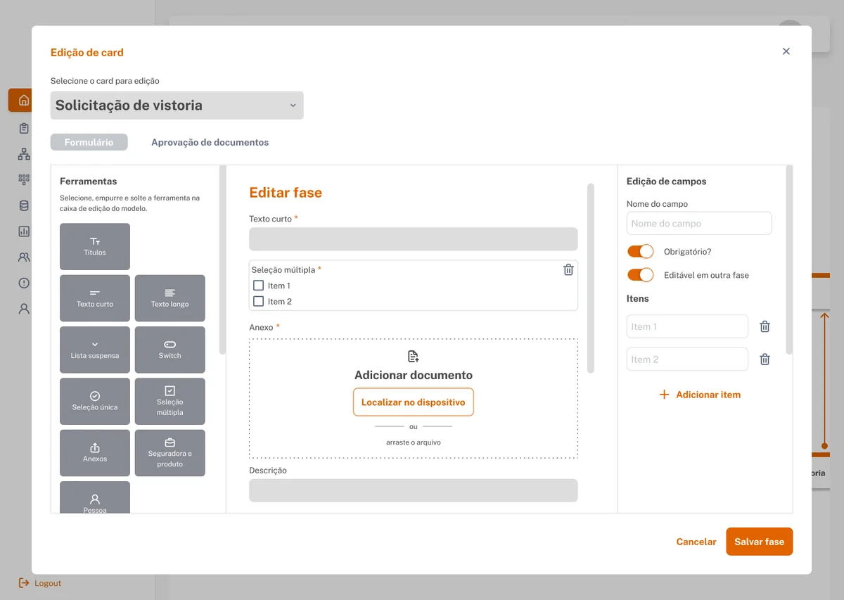
Dynamic fields
Creation and management of fields without technical intervention, reducing dependence on the support team.
Access profiles
By role, separating responsibilities within the operation and reducing noise and the risk of errors between teams.
Prioritization criterion
User impact and technical effort, considering that the first teams to migrate would have a dedicated developer supporting the implementation.
Even though formal testing wasn't in scope, I ran continuous validations in meetings with stakeholders and users, using prototypes and questionnaires to reduce risk before each delivery.
What was delivered
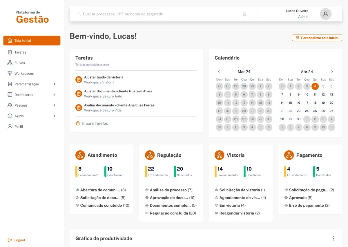
The MVP went to production, with the operation using and testing the product in a real environment. The new structure allowed teams to configure flows and fields without relying on the technical team, directly resolving the support bottleneck that motivated the project.
The decision to create access profiles by team, one of the most debated internally, was validated in practice: separation by role reduced operational noise and gave more clarity about responsibilities within the operation.
What I learned
This is the project where I came closest to a strategic role within the product. Leading sign-off meetings directly with stakeholders, defending design decisions with research and navigating internal prioritization tensions gave me a clearer view of how design and product need to work together to deliver something that truly works.
My main learning was how to communicate design decisions to non-technical audiences. Showing real usage profiles and the concrete problems caused by the lack of separation was more effective than any theoretical argument about UX best practices.
If I were to do it again, I would set up a more formal usability testing plan from the start, with metrics defined before delivery, not after. That would have given me more confidence in decisions and more evidence to show stakeholders along the way.